 Shoupapp
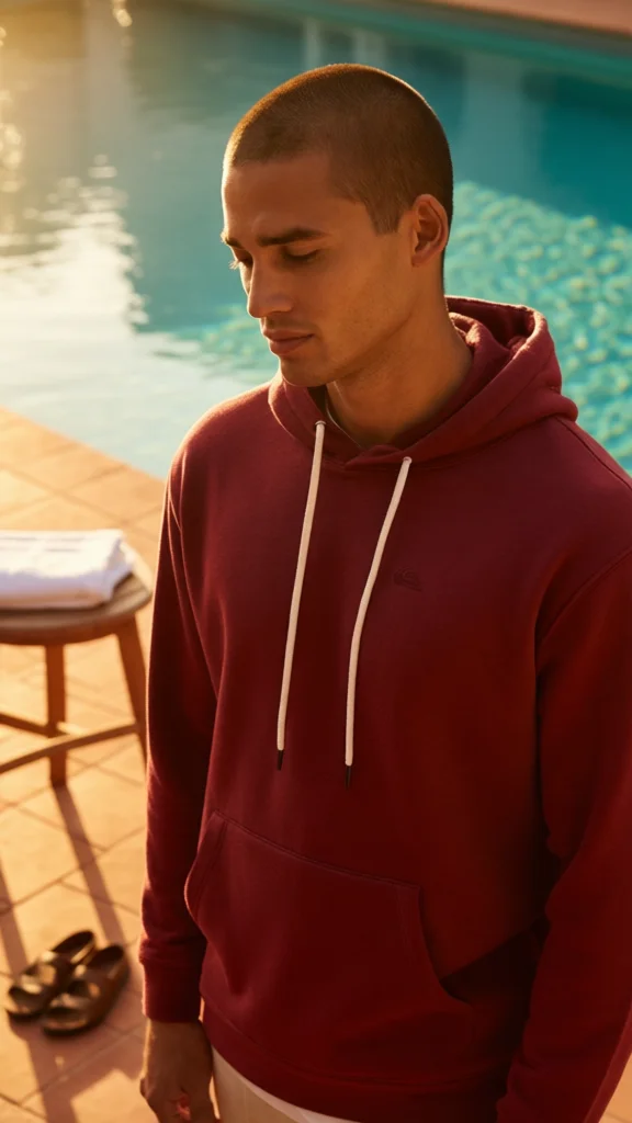
Realistic AI fashion photos are easy to promise and hard to deliver. Shoppers have learned to spot the AI look: light that comes from nowhere, fabric like plastic, hands and logos that are not quite right. This article takes one real result apart. A plain studio photo of a model in a maroon hoodie was turned into a poolside scene in warm evening light. We went through it the way a photo editor would, noting what looks like a real shoot and what does not.


What makes a fashion photo look real
A photograph is believable when everything in it agrees. The light on the face, the light on the fabric and the shadows on the ground must all come from the same sun. The scene needs depth, with a background that falls slightly out of focus. And it needs the small untidy things a real location has.
This scene gets those right. The sun is low and comes from one side, and it falls the same way on the model's face, the hood and the tiles. The pool behind him is soft, not sharp. On the stool there is a folded towel and under it a pair of sandals. Nobody asked for sandals. Details like that are what make a set look lived in.
Four things that give an AI image away, checked on this result
| The tell | What to look for | In this scene |
|---|---|---|
| Light from several directions | Highlights and shadows that disagree | Passed: one warm light from the side |
| Plastic surfaces | Fabric with no weave, skin with no texture | Mostly passed: the fleece is a little smoother than in the original |
| Changed garment details | Missing cords, moved seams, a different hood | Passed: drawcords, hood and pocket match; the small chest logo is still there but faint |
| Wrong color | The garment is not the color you sell | Failed: the maroon shifted a long way, see below |
The color check most people skip
The scene looks right at a glance, so it is tempting to publish it. We sampled the same area of the chest in both images. In the studio photo the fabric averages a bright berry red, about 182, 68, 79 in RGB. In the scene it is a dark brick red, about 79, 9, 5. Part of that is the warm, low light, which is exactly what makes the scene feel real. Part of it is simply darker.


For an ad or a social post, that is fine. A shopper understands evening light. For the product page it is not, because a garment that arrives in a different color is a common reason for a return. The rule is simple: scenes sell the mood, the studio photo sells the color. If color accuracy matters in a scene too, choose neutral daylight settings over golden hour.
The frame was extended, so part of the garment is invented
Look at the two images again. The studio photo ends just below the chest. The scene shows the whole front pocket, the hem and a hand. Those parts were not photographed. They were generated to fit a taller frame. Here the pocket looks plausible, but plausible is not the same as correct. Before you publish, compare any extended area with the real garment: the shape of the pocket, the length of the body, the cuffs.
The safest input is a photo that already shows everything you want in the result. If you need the garment on a different person or in a pose you never shot, AI virtual try-on is built for that, and on-model product photos without a model shoot explains how it works.
Start with a larger source photo
The studio photo in this test is only 600 by 800 pixels. The scene came out at 576 by 1,024, which is enough for a phone screen and not much more. Fine detail such as the weave of the fleece and the embroidered logo has very few pixels to begin with, so there is little to carry over. A source of 1,500 pixels or more on the long side gives the scene far more to work with. If all you have is small, run an AI product photo enhancer first.
A realism checklist for every generated fashion photo
- One light: do the face, the fabric and the ground shadows agree?
- Fabric: can you still see the texture you see in the original?
- Details: cords, seams, buttons, pockets and logos, compared one by one.
- Color: compare the same area in both images, and keep the studio color on the product page.
- Extended areas: check anything the original photo did not show.
- Hands and edges: look at fingers, hairlines and where the model meets the background.
Scenes like this one are made with an AI product photo background generator, without writing a prompt. Originals are never overwritten, costs are on the pricing page and every tool is on the products page. The best test is your own range: see it on your catalog.
Questions about realistic results
Why do some AI fashion photos look fake?
Usually because the parts do not agree: the light on the model does not match the scene, or the fabric has lost its texture. A believable image has one light source and real looking surfaces.
Can I use a generated scene on my product page?
As a secondary image, yes. Keep a studio photo with the true color as the main image.
Does the garment stay exactly the same?
The parts that were photographed stay very close. Parts added to extend the frame are generated and must be checked.