 Shoupapp
AI product photos have one well known weakness: logos and text. A generated scene rebuilds every pixel of the image, so letters can bend, swap or melt into shapes that only look like writing. For a branded product that is a serious problem, because a logo that is almost right is still wrong. We tested it on a product where the logo is the first thing you see: a navy Igloo water bottle with a bamboo lid. This article shows what survived, what changed and how to check your own results.


Why logos are the hardest part of a generated scene
A background generator does not paste your product into a new picture. It creates a new picture in which your product appears again. Shapes, colors and materials come through well. Text is different: the model has to reproduce exact letter shapes, and a small error turns a brand name into nonsense.
We have seen that failure ourselves. In the test behind shop the look photos, the large lettering on a snowboard became unreadable as soon as the board turned in a video. So the honest answer to "will my logo survive?" is: it depends on the product and the shot. The bottle test shows the other side.
The test: an Igloo bottle on a mountain trail
The source was a plain catalog photo on white. An AI product photo background generator placed the bottle on a granite slab next to a forest trail, in a vertical 9:16 format. From that scene an AI product video maker produced a ten second film with three shots: the bottle on the slab, a close-up of the logo, and a wide view of the valley with the bottle small in the frame.

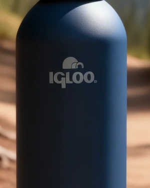
What held and what changed
| Element | Original photo | Generated scene | Video close-up |
|---|---|---|---|
| Letters of the wordmark | Reference | Identical | Identical |
| Symbol above the wordmark | Reference | Identical | Identical |
| Logo color | Soft gray | Soft gray | Brighter, close to white |
| Bottle finish | Matte navy | Matte, darker in the shade | Glossy, with a strong highlight |
| Bamboo lid and base | Reference | Kept | Kept |
The wordmark and the symbol came through letter for letter in the still image and in every shot of the video, including the close-up. That is the result a brand needs. Two things did change in the video close-up: the logo looks whiter than the gray print on the real bottle, and the matte surface picked up a glossy highlight.

For a social post that difference is small. For a product page it matters, because a shopper who expects a glossy bottle and receives a matte one has a reason to return it.
When a logo survives
Comparing this test with the snowboard test gives a practical pattern. A logo is likely to stay intact when:
- It is large and faces the camera. The bottle's logo sits in the middle of a flat looking front.
- The surface curves gently. A wide bottle distorts letters far less than a narrow tube or a folded fabric.
- The contrast is clear. Light print on a dark body is easier to keep than tone on tone embroidery.
- The camera moves, not the product. In the video the bottle stands still while the camera cuts and travels. The snowboard was turned by the model, and that is where its lettering broke.
- The source photo is sharp. The original here is 1,500 pixels square with a crisp logo. The generator cannot keep detail that is not in the photo.
A logo check before you publish
- Put the original and the result side by side and read the logo letter by letter, including small marks such as a registered symbol.
- In a video, pause on every shot where the logo is visible, especially close-ups.
- Check color and finish, not only the letters. Matte, glossy and metallic surfaces are where scenes drift.
- Keep the plain catalog photo as the main listing image and use the scene and the video for ads, social posts and banners.
- If a detail is wrong, generate again or fix a small flaw in the online photo editor for ecommerce.
A clean cutout from a bulk background remover stays your safest asset, because it contains the real pixels of the product. More on photographing bottles and tumblers is in drinkware product photography.
The bottle in this article is an Igloo product that we used as an example of a branded item. Shoupapp is not affiliated with Igloo. Costs are on the pricing page and every tool is on the products page. The best test is a product with your own logo: see it on your catalog.
Logo questions
Will AI always keep my logo intact?
No. It kept this one in a still and a video, and it broke the lettering on a rotating snowboard in another test. Always check.
Is a small logo riskier than a large one?
Yes. The fewer pixels a logo has in the source photo, the less there is to preserve. Use the sharpest photo you have.
Can I use the generated scene as my main product image?
Use the original or the cutout for the main image, where the product must be exact, and the scene where mood matters.